2018 PantoneView Palettes Revealed at Housewares Show
We’re living in a digitally directed, Instagrammed and Pinterested world where color and design trends can be communicated instantaneously, Leatrice (Lee) Eiseman – executive director of the Pantone Color Institute – told a capacity crowd Monday at the 2017 International Home + Housewares Show. For that reason, she said, it’s vital that anyone in the home and housewares business stays on top of the latest color and design trends and uses those trends to motivate or inspire consumers to buy.
Owned and operated by the International Housewares Association, the Show is being held March 18-21 at McCormick Place and features more than 2,200 exhibitors and over 62,000 total attendees from 125 countries.
There’s so much (pictures and information) out there, but sometimes we don’t know how to make any sense of it,” she said. That’s where Eiseman comes in. She studies everything from fashion runways, the art scene, television, movies, architecture, retail, theater, food and consumer goods all over the world, tracking what hues are in, what’s out and what can be used in unique combinations to catch consumers’ eyes.
Among the design trends Eiseman highlighted are: our fascination with letters and words as a design element, the use of triangles in both contemporary and retro themes, dimensional diamonds and intricacy, which is likely spurred by the explosion of 3-D printing. Wood treatments have also become “very unique and really artful,” she said. And in a throwback to the1970s, fringe is “very hot and very strong.”
As for general color trends or treatments, “Metallics we know are classic,” said Eiseman. “But they have really moved over into neutrals.” There’s also a continued fascination with iridescents. “The human eye can absolutely not avoid” anything iridescent, pearlized or translucent, she added.
Eiseman also sees a movement to more exotic or intense colors, which is a contrast to the popularity of pastels in the last few years…though those colors are not going away. “Intense colors seem to be a natural application of our intense lifestyles and thought processes these days,” she said.
Perhaps that’s also a reason for the growing popularity of design motifs that offer an escape, such as animals, jungles and the comeback of the quirky and unique Memphis Movement from the 1980s.
It’s also a reason for the current popularity of bright green hues and why Greenery was selected as Pantone’s 2017 Color of the Year. “It’s a life-affirming hue, it’s a rejuvenating hue, and it speaks to helpfulness and buoyancy,” said Eiseman. Studies also show that it’s therapeutic…when people are surrounded by the color green – even if it’s not real greenery – they oxygenate more. She said Greenery can be found in everything from today’s popular succulents, matcha tea and cars to sporting goods and even Doctor Strange’s glowing amulet.
Many of these trends are reflected in the 2018 PantoneView Home + Fashion Forecast palettes that were unveiled at this year’s Housewares Show. These eight color groupings are:
Verdure – This palette features vegetal kinds of colors like Celery and Foliage being combined with berry-infused purples and an eggshell blue. “This palette is so symbolic of health,” said Eiseman, but it updates the profusion of greens with some bright and contrasting hues.
Resourceful – Complementary colors on the color wheel – oranges and blues – are combined in this palette that is clever and “resourceful” in re-using and or re-furbishing what consumers may already own. “This is quite an interesting color combination,” said Eiseman. “It combines warm and cool tones that you just can’t avoid looking at it.”
Playful – Speaking to our need for whimsy (“People need to stop and smile” said Eiseman), the Playful palette is out-of-the ordinary and quirky. The colors are “bright-hearted more than light-hearted” with names to match, like Minion Yellow, Lime Popsicle, Green Flash and adventurous blue Skydiver.
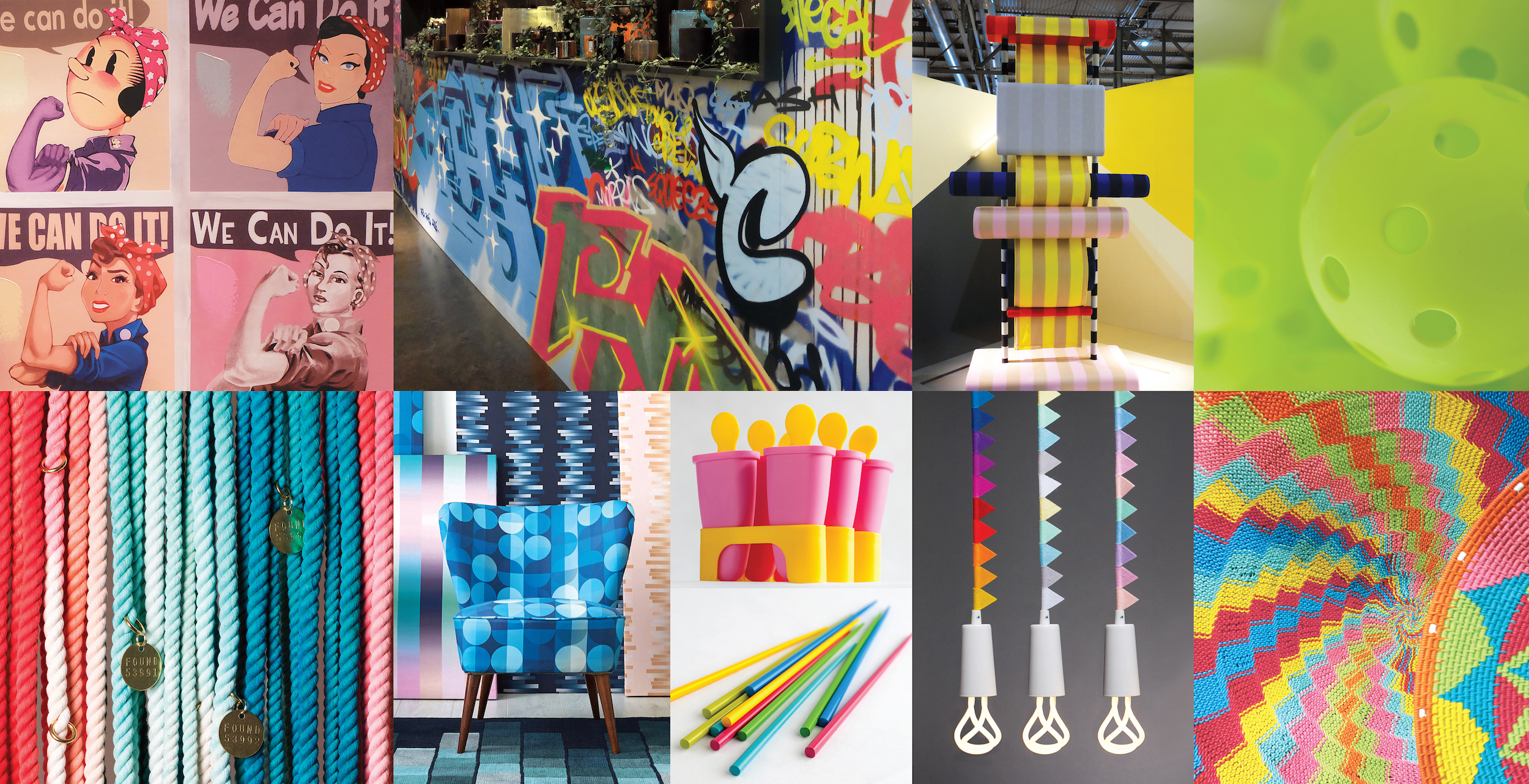
Discretion – Low-key and subtle, Discretion is the opposite of Playful. Nostalgic hues such as Elderberry, Burnished Lilac and Hawthorne Rose combine with strengthening tones to offer newness to a subtle palette. “Pink has developed more power than ever before,” said Eiseman.
Far-fetched – This palette “reaches out and embraces many different cultures,” said Eiseman. It refreshingly combines three popular rosy tones with Iced Coffee and Ruby Wine, as well as a few earthy tones such as Cornsilk yellow.

Intricacy – This palette reflects the popularity of intricate designs that Eiseman discussed earlier. It features the “new neutrals,” aka metallics, but a florid Holly Berry Red and yellow Sulfur add a layer of drama.
Intensity – Providing an eclectic mix of colors, Intensity conveys “a certain strength, power, depth and sophistication,” said Eiseman. Coolly composed shades of plum, blue and blue-green quell the fires of orange Emberglow, Molten Lava and Bossa Nova. Golds and black complete the palette.
TECH-nique – In a nod to the proliferation of technology, this palette features hues “that seem to shine from within.” Colors include a vibrant blue, green, fushia and purple, along with iridescent peacock tones in both turquoise and hot pink, that are offset by Brilliant White and Frosted Almond.
A recording of the program will be posted on IHA’s website. For more information about the International Home + Housewares Show, visit www.housewares.org.