by Leatrice Eiseman, Executive Director Pantone Color Institute
Films, fashion and design are hugely influential in color trends, as are food, consumer products and social movements. On other fronts, the healthy eating trend and the subsequent culinary culture that has evolved in recent years has also brought with it a movement in natural, earthy colors being used in packaging and on products. Shimmering materials are in vogue. As for black or white, they’re the givens. The hottest new color trends for 2019 can be grouped in eight palettes:
Cravings
Cravings is a palette that tempts the eye as well as the taste buds with spicy reds, flamingo orange and rich purples. Seductive allusions to “fetish foods” deepen the irresistible message of the palette.
Syncopated
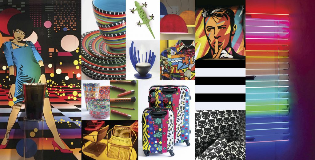
A palette pulsing with all the right moves, Syncopated is lit with energy and exhilaration by bright white, glowing yellow and a hot yellow-red.

Musings
Musings, a quietly reflective yet vital palette of gentle and hushed shades, conveys a relaxed, healthy lifestyle made even more so by a sense of pleasure and excitement.
Cherish
A grouping of idealized combinations of color, pattern and texture that form a quiet, conflict-free refuge for the senses. Cherish captures memories of comfort, enjoyment, affection and contentment.
Meanderings
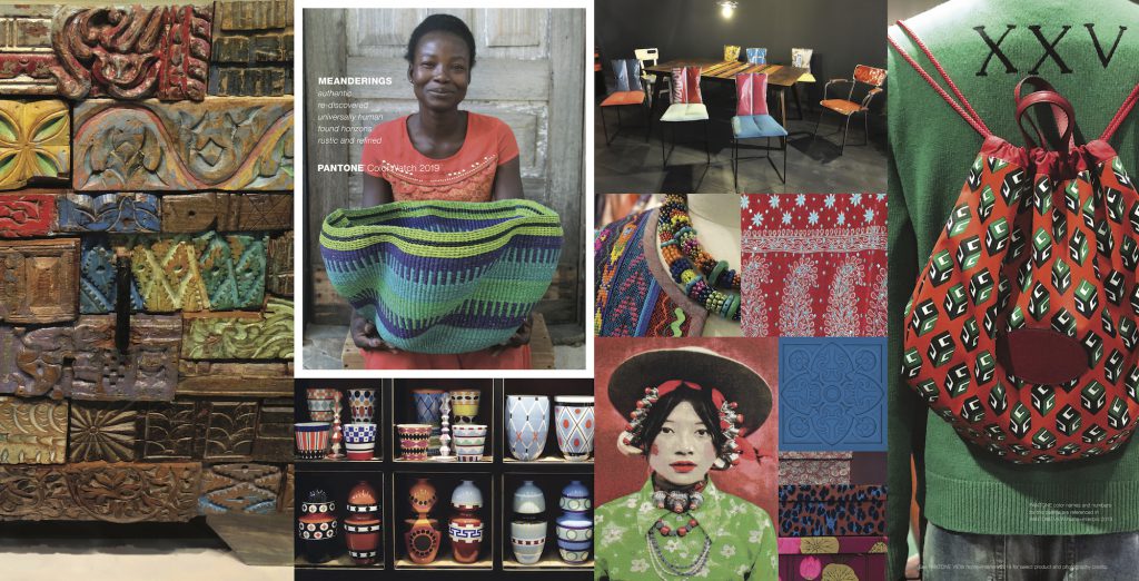
Whether traveling in person or in your imagination, to destinations known and unknown, Meanderings implies a winding course done at a leisurely pace that often reveals unexpected treasures and pleasures.

Classico
Just as the name implies, the hues of Classico are fundamental, basic and everlasting, while at the same time, elegant and forever fashionable. This is a palette where a graceful swan white and camel-colored tan co-exist effortlessly with deep teal, chic gray flannel, burgundy red and caviar black.
Proximity
Forming a hybrid of technology and nature that speaks to the complexities of 21stcentury life, Proximity gathers together sister shades of tropical green-blues and blue-greens that blend fluidly into royal blues and clean crispy greens.
Paradoxical
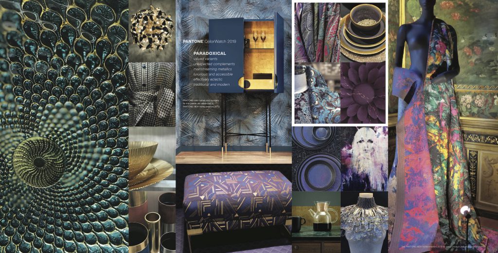
A synthetic color language that is both luxurious and accessible, the Paradoxical palette proposes style and design created by unconventional couplings, an eclectic mix of high and low and a mix of traditional and modern.

The audio recording of the presentation is available at www.housewares.org/education/presentations-webinars. For more Inspiration magazine articles, continue reading on the IHA blog or download pdf’s of current and past issues on the IHA website.
Extracted with permission from PANTONE®VIEW home + interiors 2019 trend forecast.
To learn more about Pantone or to purchase the PANTONEVIEW home + interiors 2019 trend forecast, please visit www.pantone.com.


