by Michelle Hespe
We catch up with Paul Lowe, otherwise known as “Sweet Paul” to talk about how he injects emotion into his website, magazine, blog and online retail business.
Many people have the dream of doing what they love as a living, but Paul Lowe – aka Sweet Paul – literally takes the cake. Sweet Paul has made a living off the things he loves — cooking, baking and experimenting with an inspiring array of arts and crafts. It all started out with a little old blog.
“In October of 2007, I was living in New York City as a successful craft and food stylist,” he explains. “And then I unwittingly transformed myself into Sweet Paul when I chose the name for a little blog I was writing.”
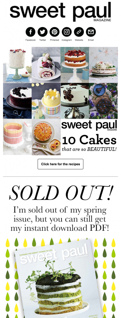
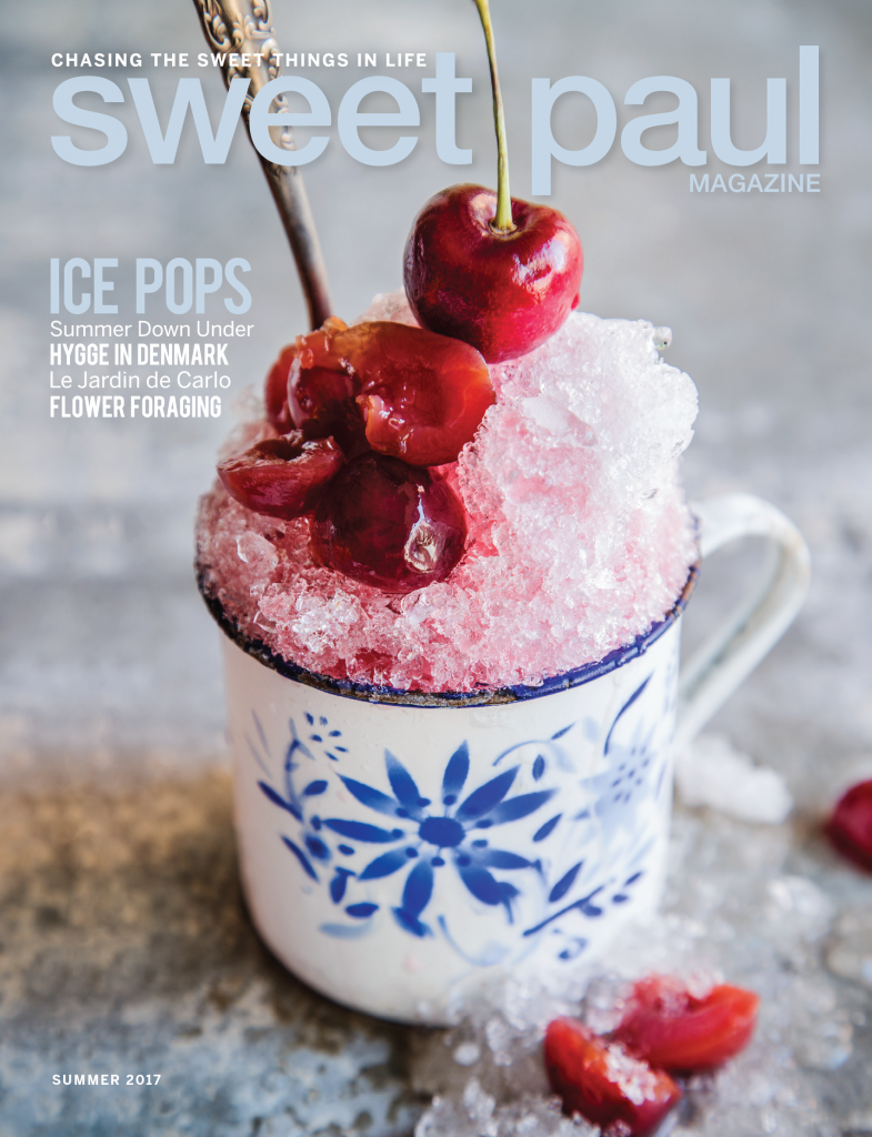
Paul’s blog became increasingly well-read, and today it’s been incorporated into the hugely popular website and magazine that’s available both in print and online, at www.sweetpaulmags.com.
Paul credits his passion and talent for cooking and art to two women who adored his inspiring pastimes as much as he does today. They were his great aunt “Auntie Gunnvor” and his beloved grandmother, “Mormor,” who raised Paul in Oslo, Norway. He pays homage to the two women by living by his late Mormor’s motto: “Fullkommenhet er kjedelig,” which translates to: “Perfection is boring.”
“They were not perfectionists, but they had so much fun with everything they did,” he says of his aunt and grandmother. Carrying on their tradition, through his work and many creations, Paul wants to inspire people to create things and approach life, in general, with love. “If a cake comes out a little lopsided, don’t worry, I’m sure it will taste great!” he says.
When Paul first started his blog, he never imagined that he’d be where he is today, with between 4 and 6 million page views per issue of the magazine, around 275,000 visits a month to his blog and over a half a million followers upon an array of social media platforms. “I’m still surprised every day, and honored that so many people love my work,” he says.
 There are many reasons why Sweet Paul is so popular, but part of the appeal is that the magazine and blog pull on the heartstrings, and the creations and content are often sentimental. Emotion is ever-present in everything that Sweet Paul does, and as he says, that’s due to the love he puts into every project. “To me, it’s all about making whatever we post personal,” he explains. “We add little stories from my life and childhood and I make sure that the voice we write in is true to the Sweet Paul brand. I talk a lot in superlatives, with emphatic passion, as I want to make a connection with the reader. If we post something with brand partners in a voice that’s not true to Sweet Paul, our readers can sense that.”
Paul’s stories are so endearing because they all have a personal touch. “I love using handmade props, often made by me, as I want the reader to see how much fun I’m having and the love I have for this work,” he explains.
Inspiration shines through on the website, with everything presented in a light and bright manner. “I don’t use many heavily filtered images,” he says. “Much of my work is shot on bright white surfaces. However, I do think that there are so many websites these days that stick rigidly to one aesthetic, and they end up looking a bit cold and uninspired. I love a good minimal food shot on a white marble surface, but if that’s the only style on your site, it can get a bit stale.”
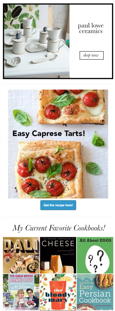
Paul recommends adding some lifestyle shots to a website’s product pages, as it can add a sense of approachability and emotion. “I get sad when I see unhappy looking stone-faced models or cold, minimal over-filtered product shots,” he says. “Show off a product in use, in a real-life environment, or let the viewer see a kitchen counter that might be a little messy because you’re baking a cake or a warm table-scape that shows off people enjoying a meal. These types of things allow people to connect and relate to the products more than standard silhouetted product images on white. Huge retailers are doing this these days. For instance, if you look at the Kitchen & Home section of Amazon, you’ll see a lot of beautiful lifestyle photography, whereas a couple of years ago it was all silhouetted kitchen appliances floating on a white background.”
Paul doesn’t regularly follow other websites and he’s not a fan of following trends. Instead, he simply focuses on producing unique, fresh, fun content. “There are so many places aside from the Internet to get inspiration from, and I’d never want to try and replicate anything I see from others online,” he says.
“I love to travel, shop, walk around my city and get inspired by the interesting people and places I come across. I don’t care about trends, as I believe in making my own. Sometimes I even take a counter-intuitive approach with colors — for example, creating a white Halloween story, or I love a blue-themed Christmas.”
The fact that Sweet Paul is authentic and his website is so emotionally charged is no doubt why so many people are attracted to his brand. That emotional pull not only comes from Sweet Paul, but from the wonderful women who raised him to have fun in life, teaching him to spread the love. “I’m a bit of a softie, but don’t tell anyone!” he says, laughing. “But honestly, I feel the best way to engage readers is by being genuine and doing everything I do, from the heart. If I LOVE something, people know it. The Sweet Paul voice that I use always focuses on what I love and what makes me happy.”
Sweet Paul’s Golden Rules for a great website packed with emotion:
- Be original. Cement the essence of your brand and produce authentic images and content that sing about your brand.
- Work with the best people you can afford. Listen to their ideas and be open to letting them be creative!
- Be genuine. Readers and consumers can spot a fake right away.
- Be approachable. People want to be able to relate to what they’re looking at. They want to hear a voice that’s talking to them and showing them a world that they can imagine themselves in.


